A Story of Red

Red attracts attention. It jumps out and comes forward. That is why commercial artists use it in advertisements and packaging. However, in what we call “fine art” the artist has more to be concerned about than merely attracting attention. The fine artist’s goal is to interest discerning viewers in the art itself and keep them interested.
From the sixteenth century to the present, fine artists have often used small amounts of red in their paintings — a little goes a long way — to set off the quieter blues, greens, and browns. Because red comes forward, they use it in the foreground, insuring that the foreground is seen to be foreground, as in the paintings below. 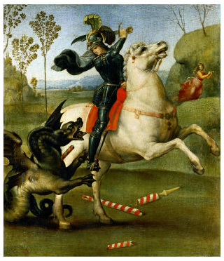
1504, Raphael (Italian), “Saint George and the Dragon”

ca.1635, Anthony van Dyck (Flemish), “Portrait of King Charles I of England”
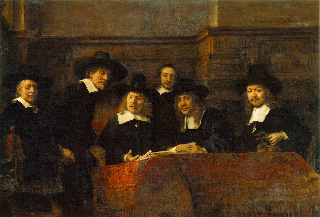
1662, Rembrandt van Rijn (Dutch), “Syndics of the Draper’s Guild”
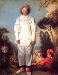
ca.1719, Watteau (French), “Gilles”

1878, Claude Monet (French), “The Red Kerchief”
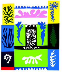
1947, Henri Matisse (French), “Amphitrite”
If you cover the red in any of the paintings above with your hand you can test its importance to the composition for yourself, and decide whether there seems to be something lacking without it.
By the nineteenth century, artists were losing interest in precise realism — with vanishing point perspective, shadow, and smoothed surfaces — and leaving it to newly invented photography. This freed artists to experiment with distorted perspective, painterly textures, and color. Color choice was no longer limited to colors that matched reality. For example, red could be made unnaturally intense and used ever more broadly.
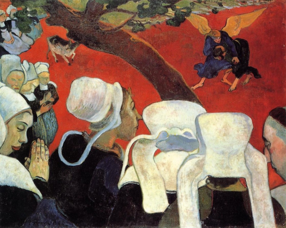
1888, Paul Gauguin (French), “Vision After the Sermon”
In the painting above, Paul Gauguin used an intense red as background, which glowed next to the whites and blacks in the foreground. Twenty years later, Matisse produced a similar effect.
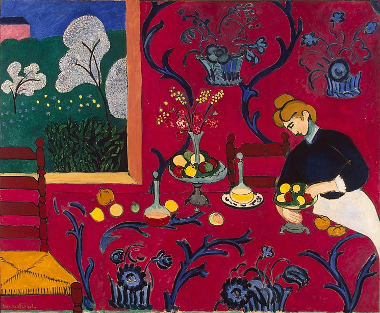
1908, Henri Matisse (French), “Red Room”
Matisse went even further. The “Red Room” was one of several paintings in which he used red as background and used more of it than any other color. Both Matisse and Gauguin toned down their background reds in places to prevent them from overwhelming the other colors, but still leaving them bright enough to come foreward. When the background comes forward, deep distance is lost, and the space flattens.
Flattening was one of their aims. But, red can’t do all the work of flattening by itself. In these two paintings, not only the rich red, but the contrasting yellow and bright blue also come forward. The bright color contrast and resulting flatness is supported by the almost total reduction of the lights and darks to stark black and stark white. Patterns flatten a surface. Matisse systematized the patterns in “The Red Room” to contrast or to echo. The small white marks that describe the flowering of the tree outside contrast with the expansive design on the tablecloth and wallpaper inside. The tree’s curved branches echo the bold curves on the tablecloth and wallpaper. Pattern, black and white, color intensity, and the color red work together to produce flat design. |

