Between Lightest Light and the Darkest Dark

Each color in a traditional, realistic painting can be placed somewhere along the continuum of dark to light tonal values. A black and white photograph of the painting would show how the colors look when their color is removed. So, not only must artists choose their colors, but they have to judge how light or dark the colors should be, and then they must decide in what order to lay the colors down so the effect of each color and tonal value will be coherent with all the others.
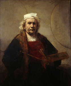
Rembrandt Van Rijn (Dutch, 1606-1669) used the full range of dark-to-light tonal values. Working according to tradition, he would have first painted a mid-tone ground — its tonal value in the middle of the continuum between black and white — on his prepared canvas. On top of these mid-tones, he would have laid in the shadowy dark areas with dark, transparent glazes and built up the lighted parts with increments of lighter and lighter color made opaque by added white. This is especially true of the face, the center of interest, which contains the most detail and the most precise modeling. The lightest parts, the highlights, which land brightly on the white hat, are echoed on the forehead, down the cheek and brought to the center of the face with a dot on the end of the nose. The hat, the lightest part of the painting, is treated with casual, broad strokes and so helps frame the face without competing with it for attention.

An artist may use some black and some white with the tones in between to bring out the volume of the subject matter. He may also use the black, the white, and the tones in between purely as design elements. Eight-year-old Arthur Schleizer painted a picture of a small tiger cat on a rug. The bluntness of his brush made precision difficult, however, and bits of the white canvas remain untouched among the heavy black and red applications of acrylic paint. Even though the red glows next to the black, red has the tonal value of a middle gray, as the de-colored detail shows. The effect would be muddy without the sparkle of the bare, white canvas. Artistically, Artie hit upon an important rule-of-thumb for a painting, whether by Artie himself or by Rembrandt: to include the light and the dark extremes.

To show how I go about incorporating these extremes in a picture as I believe Rembrandt did, I took a photograph of my little watercolor of a cow and a chicken when it was half finished. Having no dark darks or light lights, the picture’s tone was limited to the middle ranges, without the contrasts art requires. At that stage, a picture reminds me of the bland music we hear in public places that lacks high notes and low notes and therefore attracts no interest, which is why it’s called “background.” After taking the photograph, I honed in on the details and widened the range of darks and lights with a highlight on the horn and some strong darks on the cow’s face and in back of the chicken. I added these extremes to put the mid-tones in their place between them and make them sing.
|

